Logo design is essential in creating a successful brand or business, and can be the difference between someone using your business/service, or losing out on a customer. Below are examples of both good, and bad logo designs, with my opinions on what makes them (un)successful!
Good Logo Design
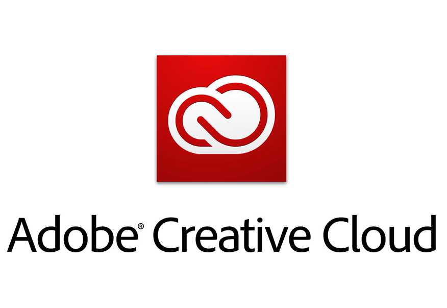
The Adobe Creative Cloud logo is successful in representing the company. The simple use of the letter C twice, to form a cloud is a clever idea, and brings so many elements of the company into one image.
The simple colour scheme also works well, with contrasting red and white to draw the eye.
Poor Logo Design
![]()
This logo for the company Melon Tech, is an example of poor logo design. The reason for this is primarily the fonts used, the colours used, and the differing styles between the text and the image.
Leave a comment